WORKED EXAMPLE / UPCRAFTED STUDIO
One technology brand, a connected campaign
A launch needs more than a strong cover slide. It needs a visual language that can explain an idea, present evidence and make the next step obvious. This worked example uses Bend to show how a small set of decisions can hold a campaign together.
An in-house example campaign, not a client case study or a claim of measured results.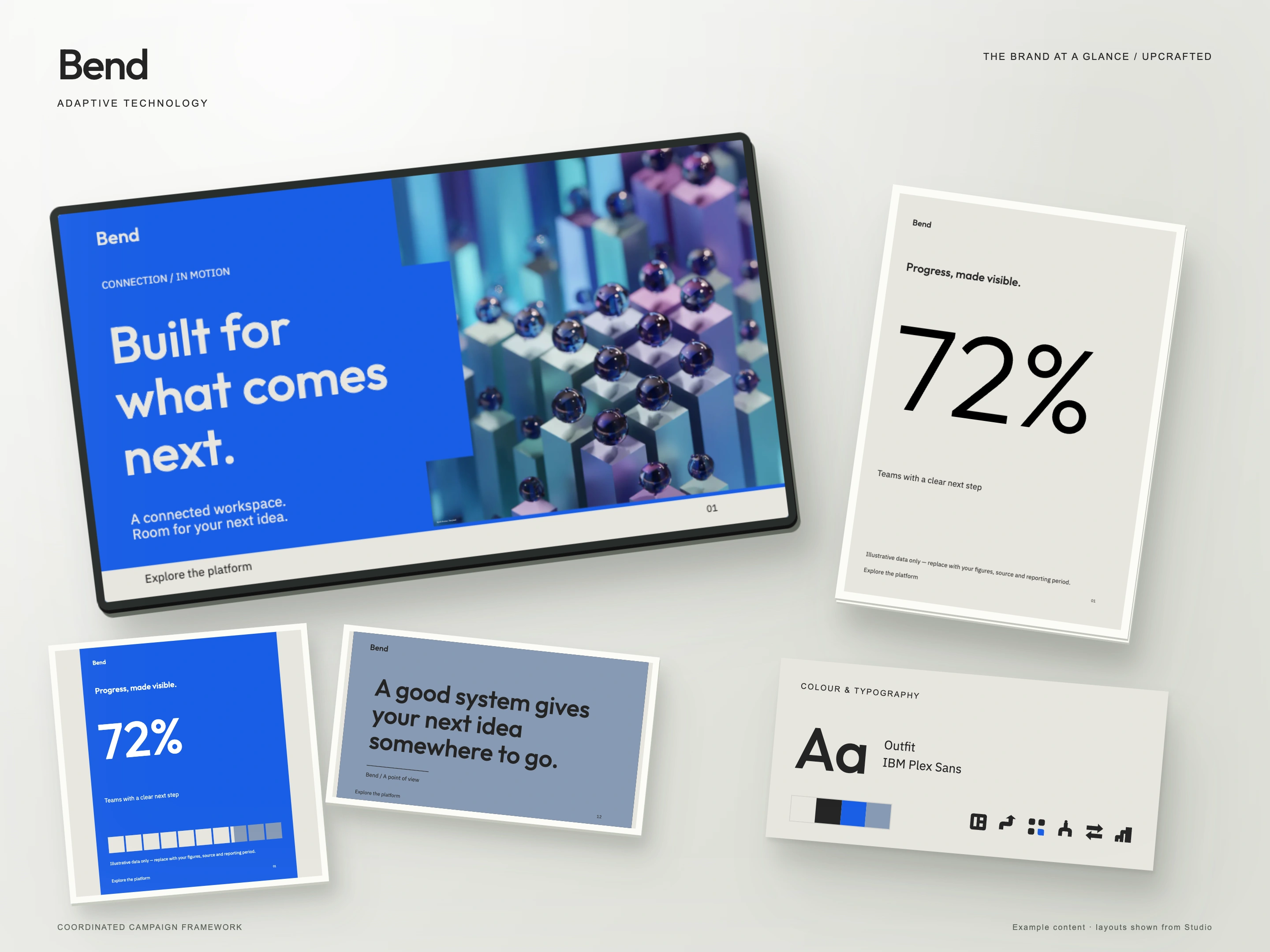
01
Start with the message
The example brief is a connected workspace for teams. The central message—“Built for what comes next”—is short enough to lead a slide or a social post. Supporting copy explains the benefit in plain language. Before choosing a layout, separate the promise, the evidence and the action; they should not compete at the same size.
02
Give each colour a job
Cobalt is the attention colour. Warm chalk gives longer passages a quieter surface, while carbon carries text and structural elements. Steel blue provides a secondary panel without creating another competing focal point. Carry these roles between formats instead of choosing new colours for each page.
03
Build hierarchy before decoration
Outfit gives the headlines a rounded, confident voice. IBM Plex Sans handles supporting copy. Keep the headline dominant, shorten its line length when the format narrows, and move secondary information below it. The same headline does not need the same line breaks on a widescreen presentation and a portrait post.
04
Adapt the composition to its setting
The presentation cover gives the message and photography distinct areas. The portrait example gives one statistic room to lead. A quieter editorial layout can focus on a single statement. Consistency comes from typography, colour roles and spacing—not from squeezing the same composition into every ratio. The 72% figure shown in the example is illustrative; replace it with a substantiated result and its source before publishing.
05
Keep the imagery purposeful
Bend’s photography direction uses repetition, structure and unexpected material details. Select an image that reinforces the story rather than merely matching the blue palette. The kit uses replaceable photograph placeholders; the imagery in the overview demonstrates direction and is not a bundled stock-photo license.
06
Make your own version
Begin with your audience and one message. Replace the sample copy, then choose the required outputs in Studio. Check every format for line breaks, image crops and a clear action. For independent editing, install the included fonts and open the SVG layouts in a compatible vector editor. The current kit includes Studio and SVG files; native Canva, Figma and Adobe documents are not included.
Keep exploring: A community campaign with a shared visual voice